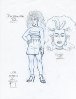
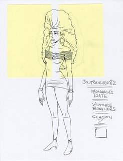
 This is from last week's episode, Victor. Echo. November. A while back, I mentioned that I had lots of trouble getting into the Venture Brothers style when I started as a designer on the show. Here's a great example of the evolution from my style (which as I mentioned before, was pretty much the Aqua Teen Hunger Force style) to the VB show style, as I worked on the character, Jollyrancher82. This first example shown on the right is a decent drawing, and I definitly used some of the stuff going on there in the final design, but as a whole it's way off. In fact, as I look at it today, it's so ATHF. I don't even think I showed this one for approval.
These next two were a lot closer, but still no cigar...
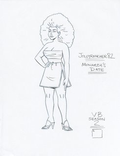
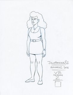
This is pretty much the final design with a few notes from Jackson Publick on the upper left.
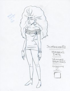 And, this became the final design. You can see that I had to thin up the "big hair", so she wouldn't obscure the entire background.
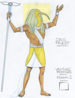
 Here's the Ibis Priest. In this case, he was pretty much approved on the first round of approvals.
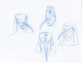
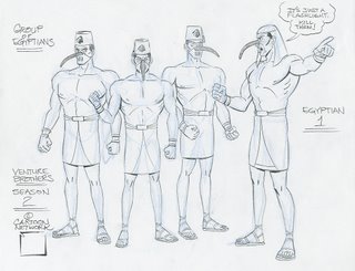
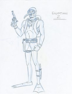
 I attempted this gag throughout a whole round of drawings. I thought it would be pretty retarded (and therefore funny) if these Ibis Henchmen had these ridiculous ibis beaks on their masks. Mr. Publick didn't go for it, but here they are for your enjoyment!
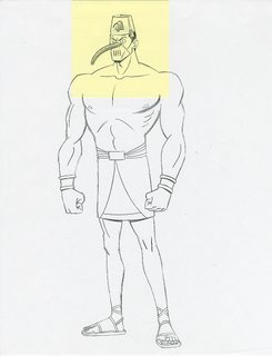
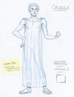
 My first design of Caligula when I was really trying to push the design towards Malcolm McDowell, and, more notes from the big guy on the bottom left.
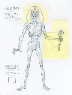
 Mr. Publick had to pretty much redraw this to arrive at the mummy that you see in the episode, but I always thought this drawing was cool anyway. Here's to drawing classic monsters!

3 comments:
these are awesome matt!
great stuff!!
Thanks!
Lots more (and better) stuff coming once the later shows air (which is when we - see below - were all getting really warmed up!).
The 2 other VB designers:
Chris George
Martin Wittig
(We gotta bug Martin to post some of his VB stuff!)
Post a Comment